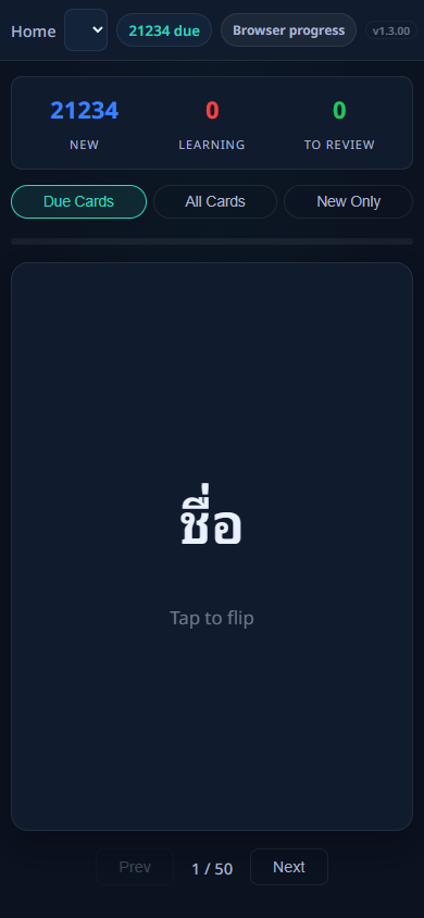
Screen 1 of 5
Home / Dashboard
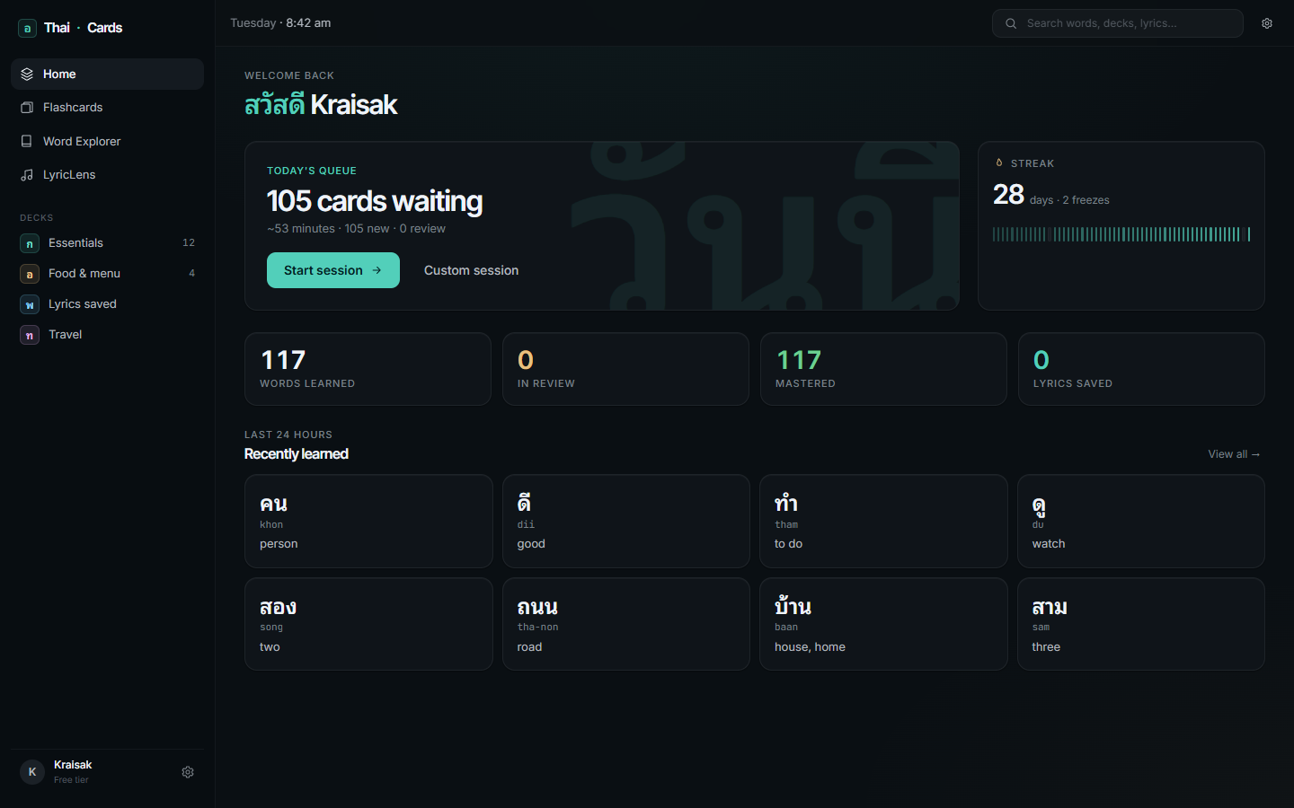
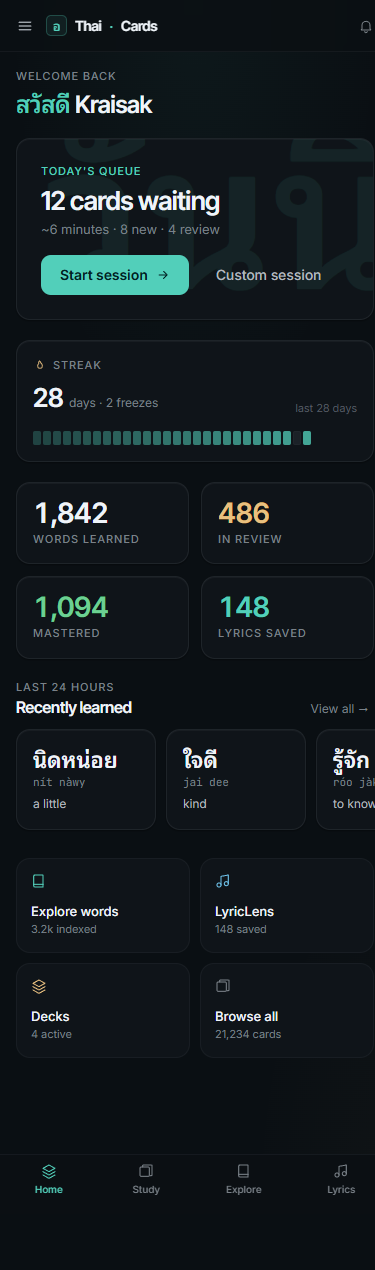
The old home was actually the study screen — no separate dashboard. The refresh splits them: a real dashboard with today's queue, streak, stats, and recently-learned words. The "after" panel below loads live data from /api/decks and /api/flashcards.
Before desktop · 1440px
After desktop · 1440px · live data
Before mobile · 390px
After mobile · 390px
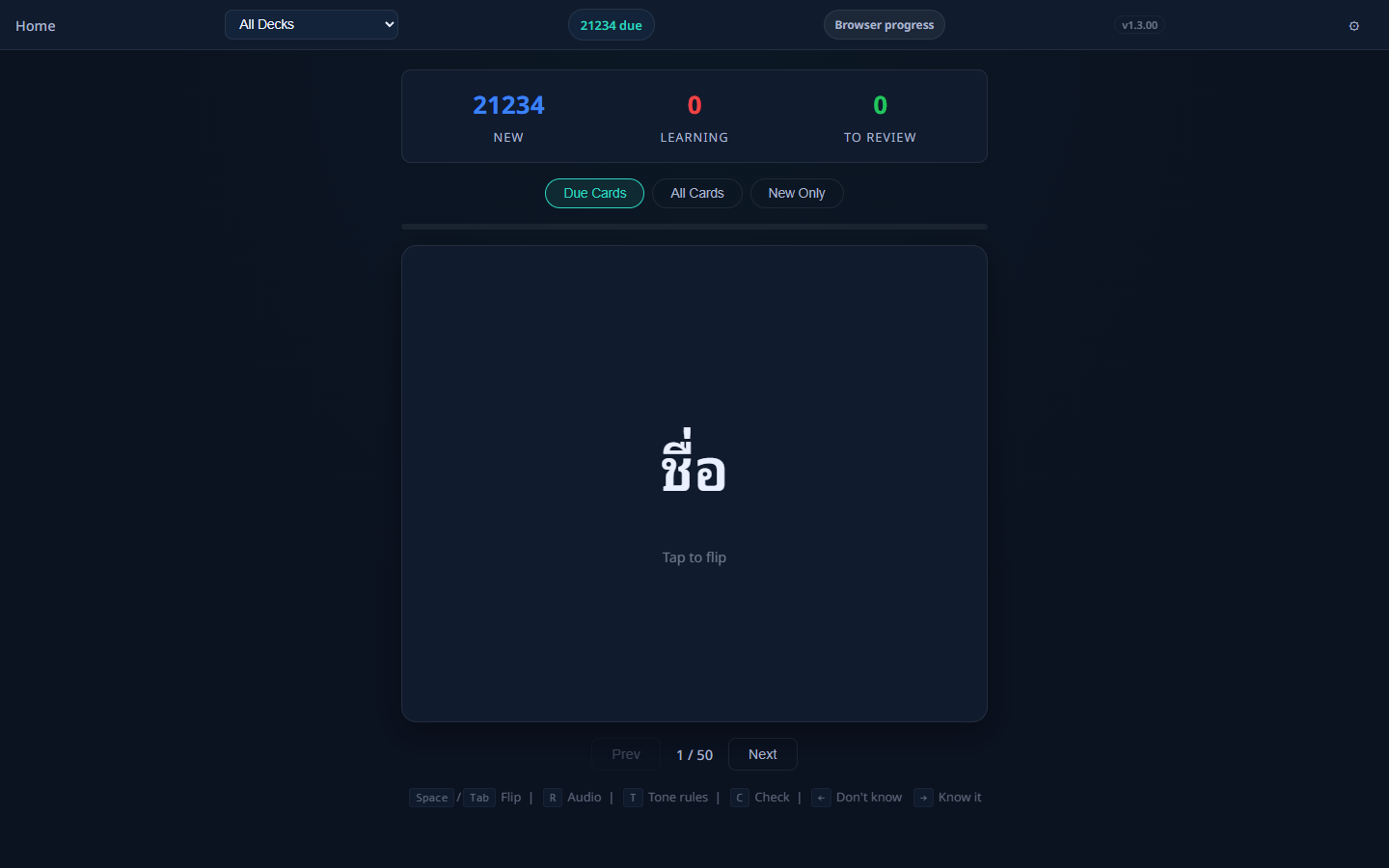
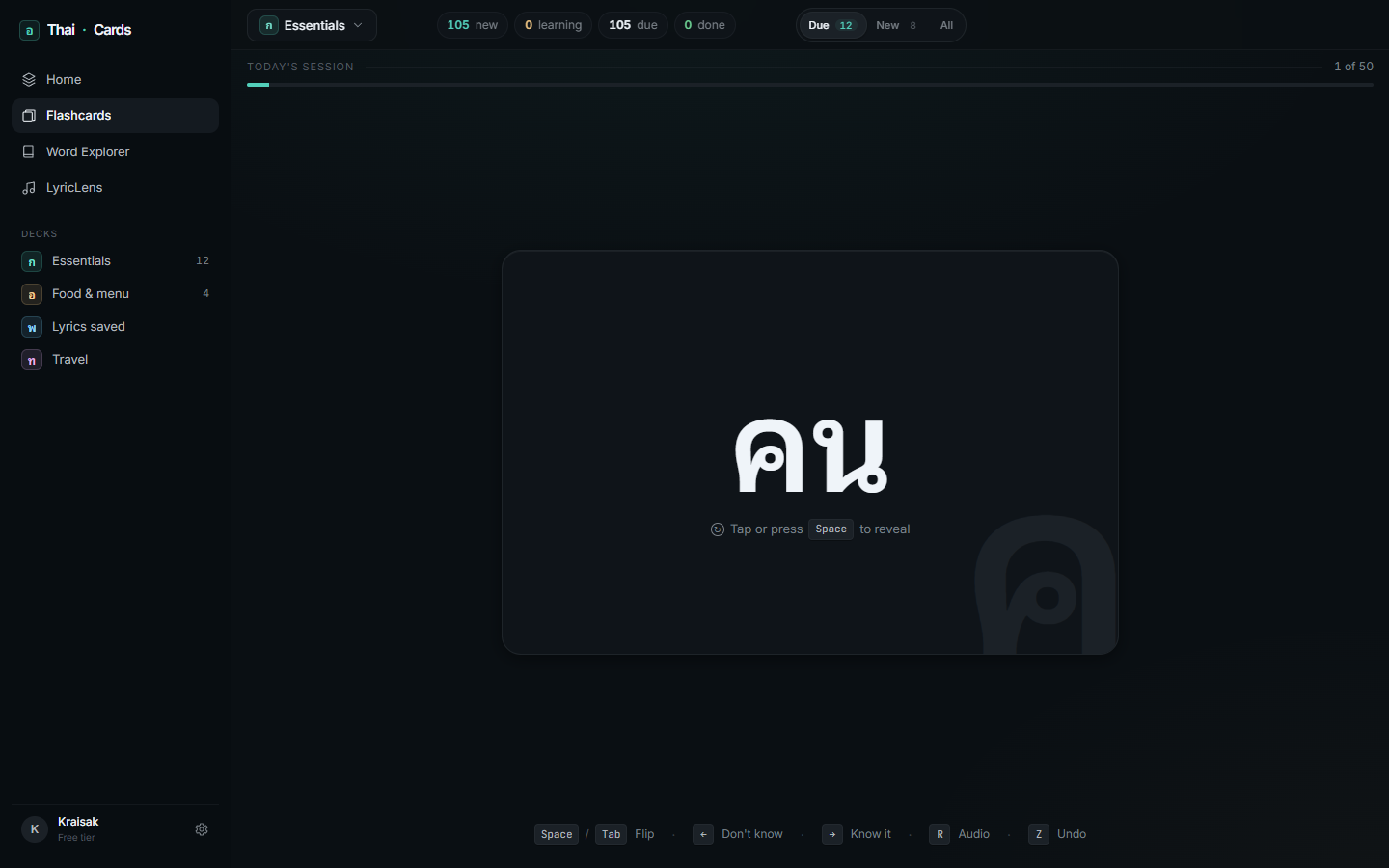
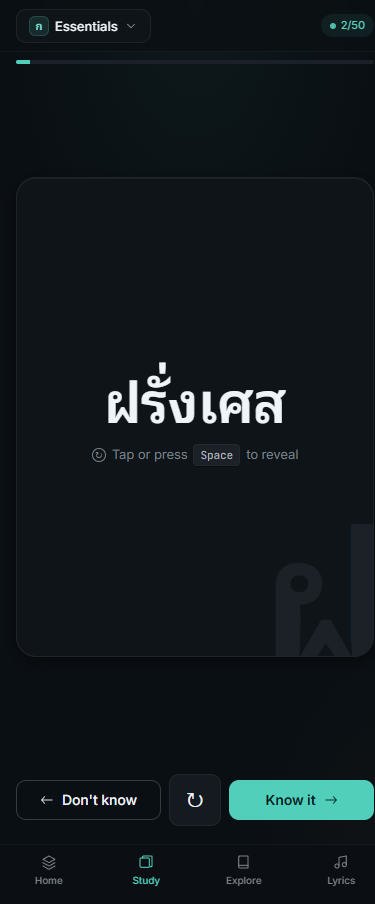
Screen 2 of 5
Flashcards study
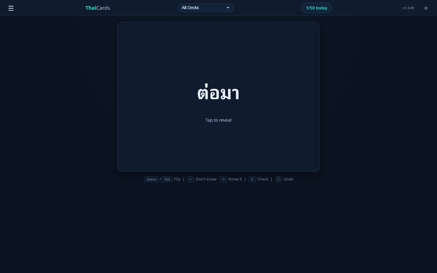
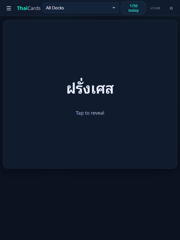
Core study loop: big Thai glyph as protagonist, large watermark in the corner as visual identity, keyboard-first on desktop with the shortcut row visible at the bottom. Mobile is swipe-first with the three-button action bar.
Before desktop · 1440px
After desktop · 1440px · live data
Before mobile · 390px
After mobile · 390px
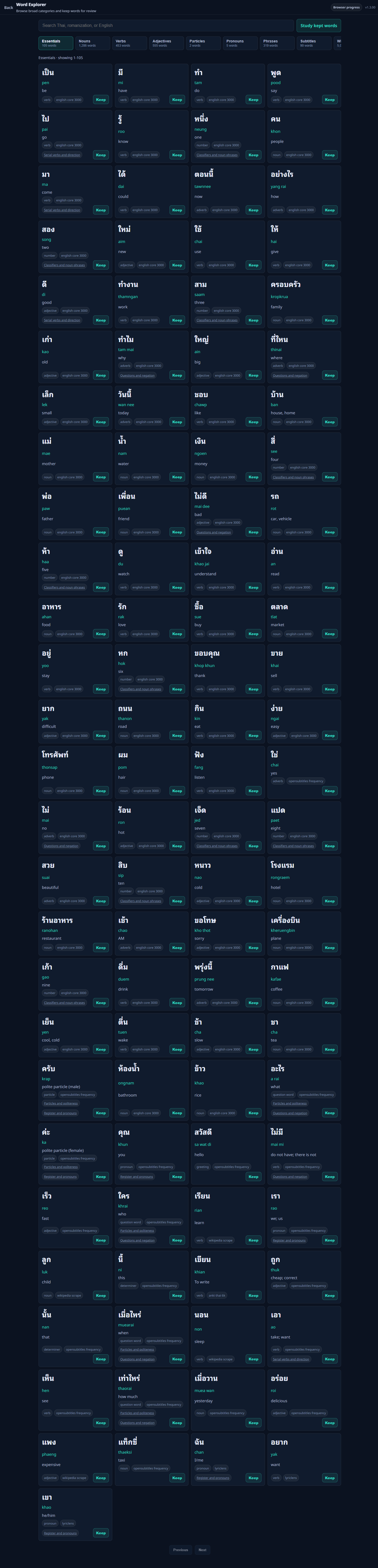
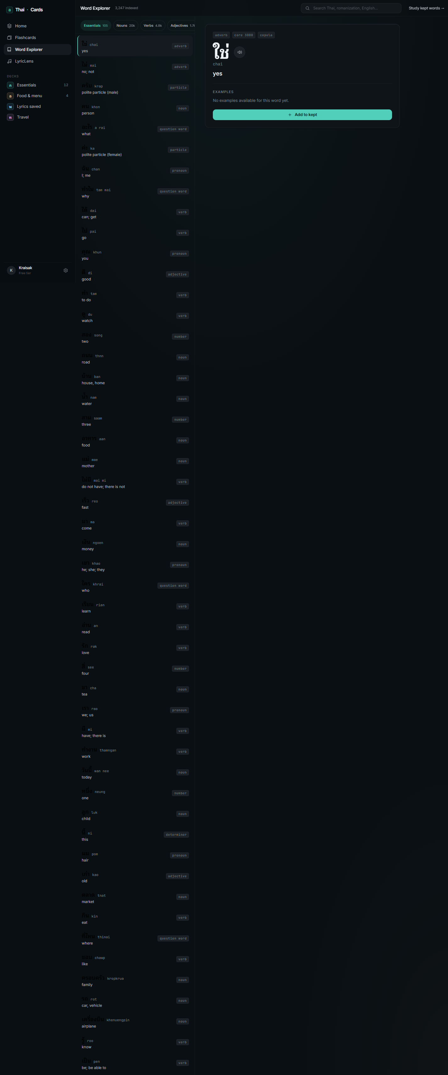
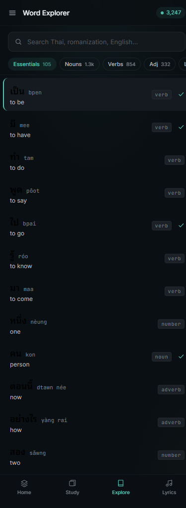
Screen 3 of 5
Word Explorer
Two-column list + detail on desktop, drill-down navigation on mobile. The detail panel shows examples (with the lookup word highlighted in teal), related words, and a single "Add to Essentials" CTA.
Before desktop · 1440px
After desktop · 1440px · live data
Before mobile · 390px

After mobile · 390px
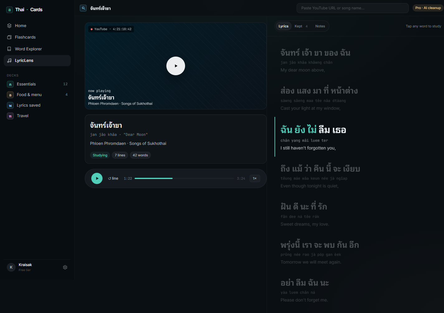
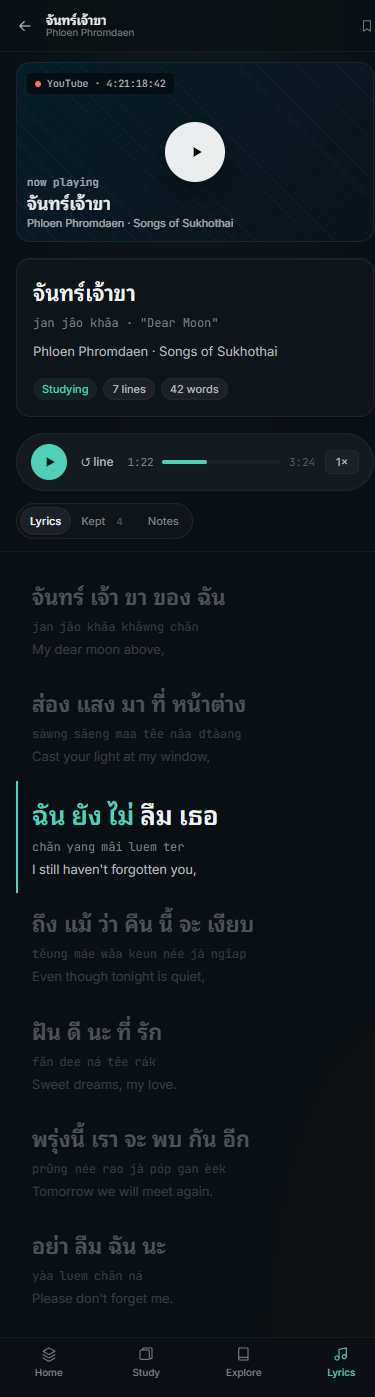
Screen 4 of 5
LyricLens — lyrics study
Synced lyrics with karaoke fill on the active line, tap-any-word for a translate popover, "Add to deck" wires straight into the same flashcards data store. The mobile layout stacks video + lyrics vertically.
Before desktop · 1440px
After desktop · 1440px
Before mobile · 390px
After mobile · 390px
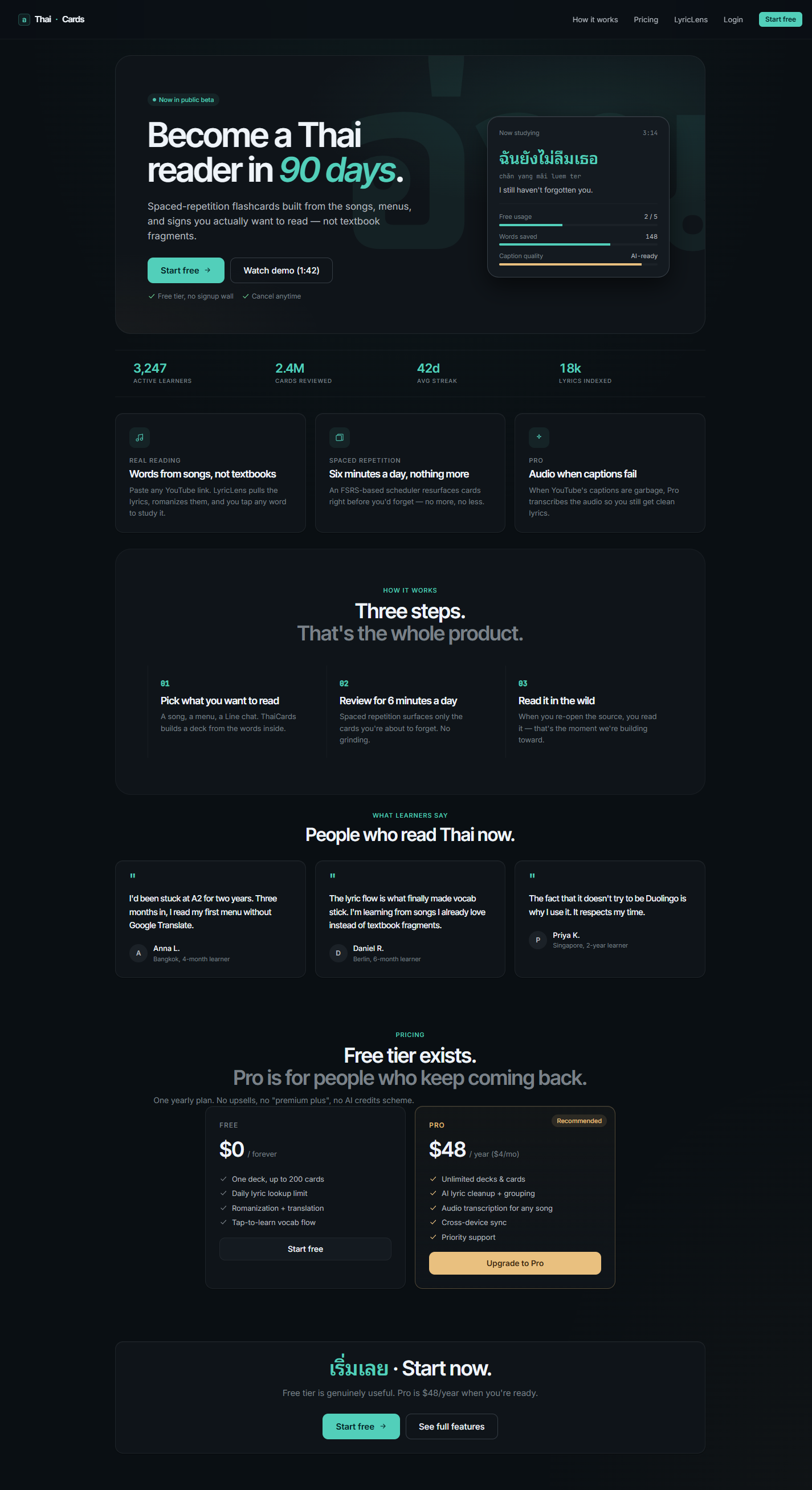
Screen 5 of 5
Landing / funnel
The biggest visual shift. Hero with a sharper value prop, social proof stat row, feature grid, three-step "how it works," testimonials, two-tier pricing, and a sticky bottom CTA on mobile.
Before desktop · 1440px
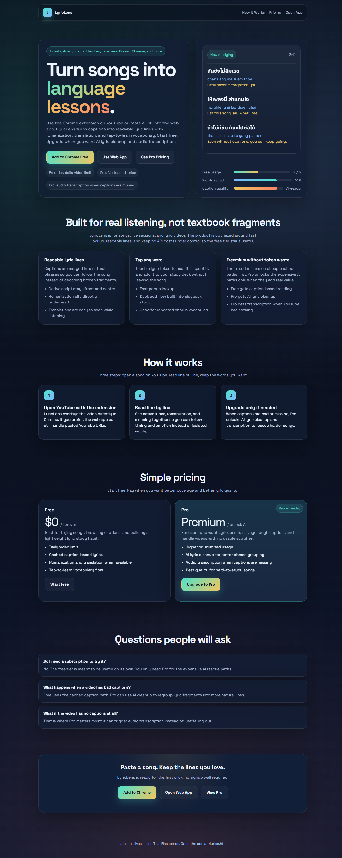
After desktop · 1440px
Before mobile · 390px

After mobile · 390px
